Case study
The brief
Kestle Design Week wanted an identity that felt friendly to families and still serious enough for the trade programme, across five days and forty venues.
What I did
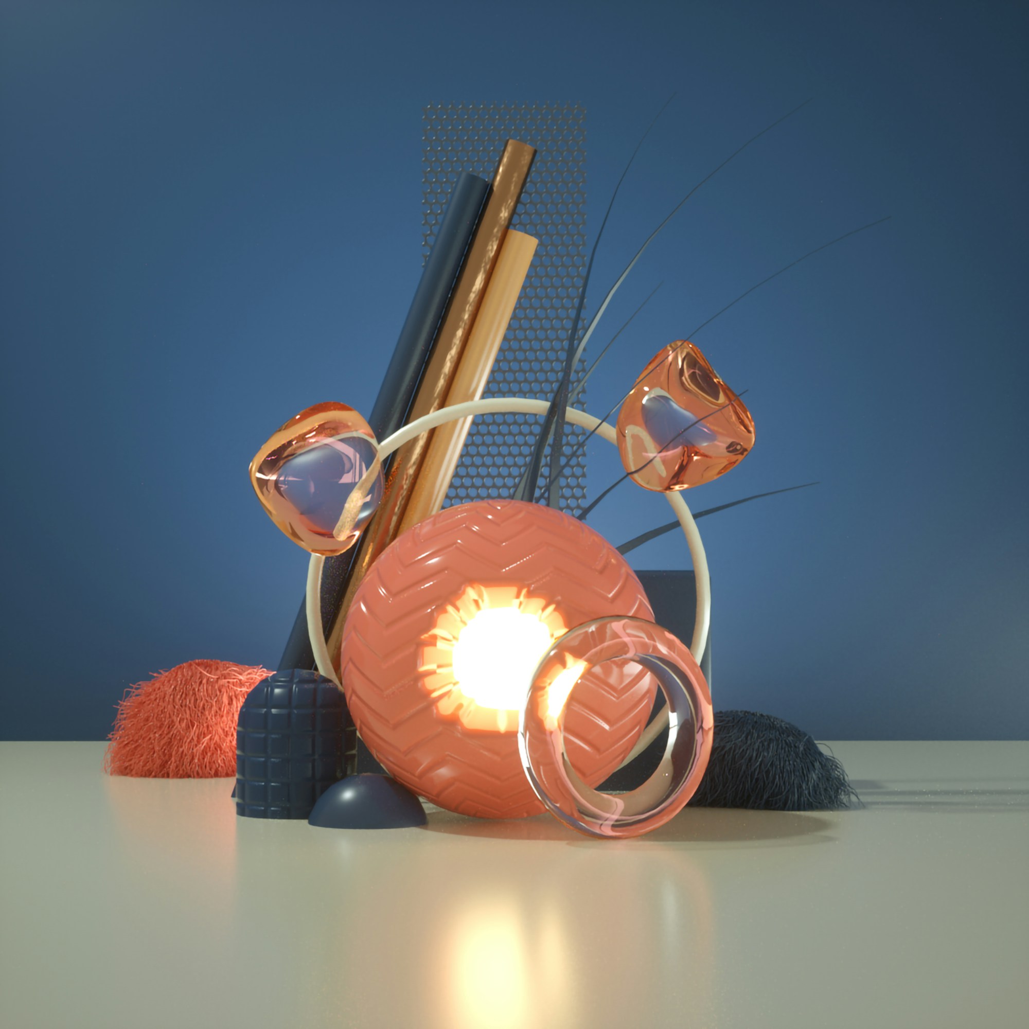
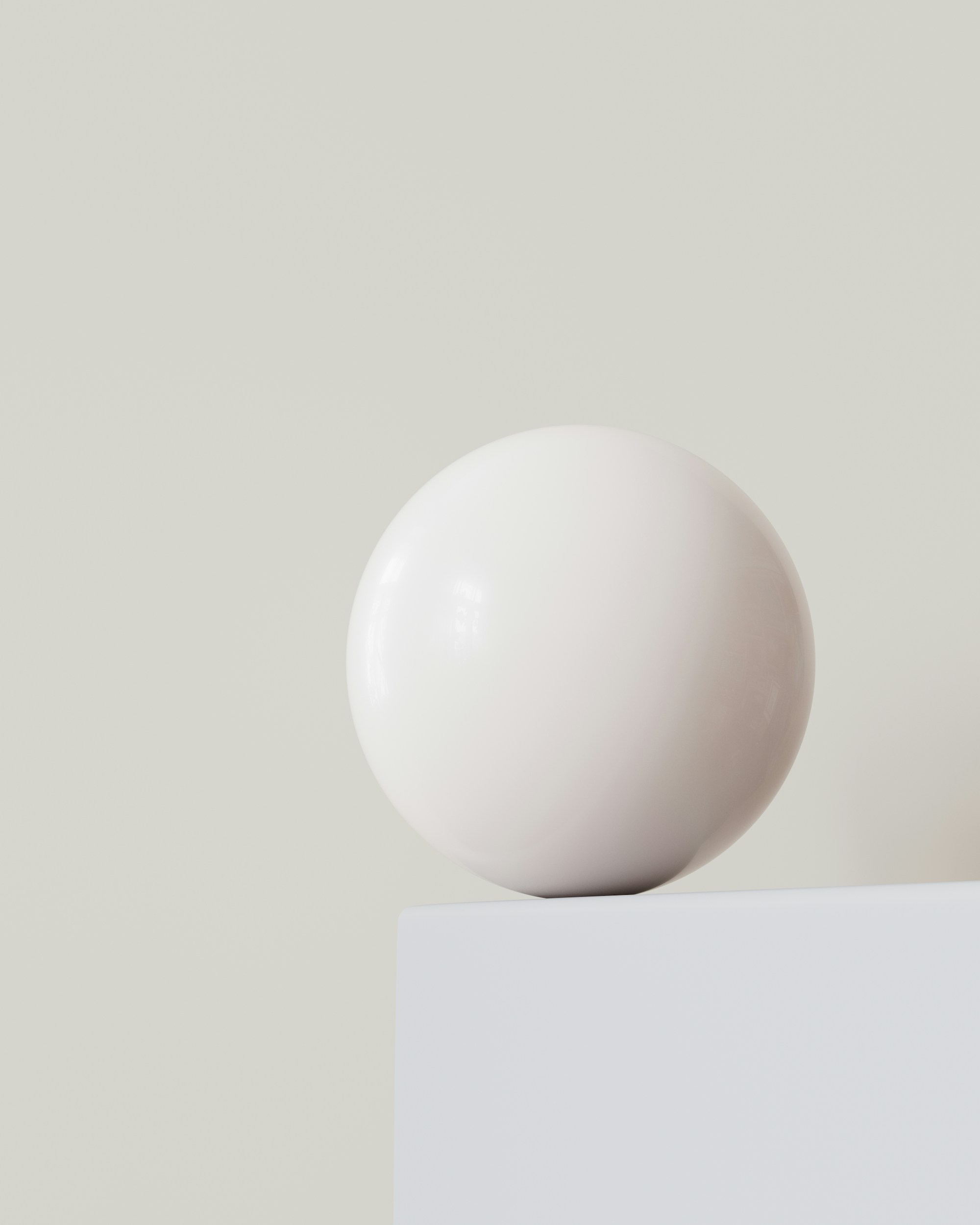
A set of soft, rounded 3D forms, one per festival theme, rendered in pale colours. They became posters, badges, wayfinding and a twelve-second title sequence for the opening night.
Result
Visitor numbers rose 22% year on year, and the forms were kept for the next edition.